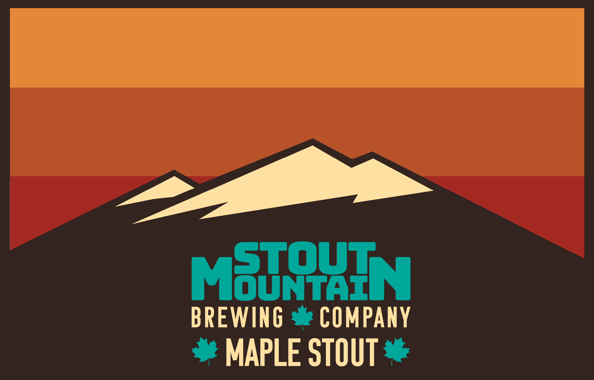
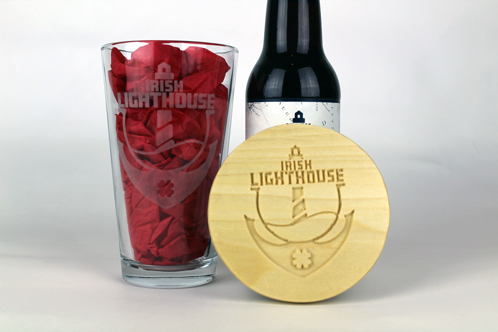
My senior exhibition consisted of branding designs for three fictional brewing companies. The goal was to have a logo, bottle labels, a 6 pack design, coasters, pint glasses, and an advertisement for each company.
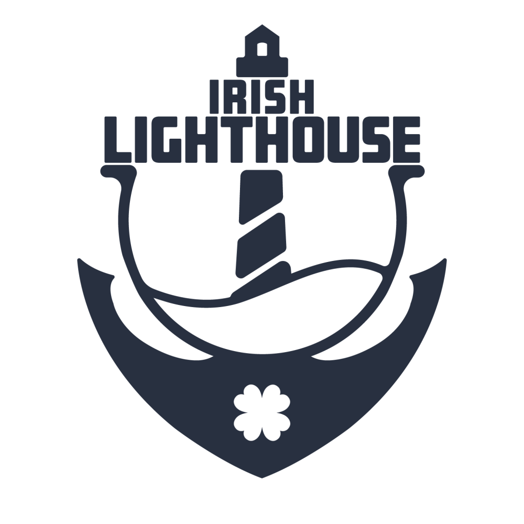
Irish Lighthouse is a brewing company on the coast of western Ireland. Being on the coast and being Irish allows for a lot of imagery and inspiration. Focusing on those nautical and Irish themes I settled on a few key elements to use in the logo and branding. Starting with the most obvious symbol, the lighthouse is placed prominently in the center of the logo, and directly interacts with the type. Beneath it is a wave, not only to represent the ocean but also to represent beer in a glass. The symbol that houses both the wave and lighthouse is a horseshoe. Often referenced as a sign of good luck or fortune, it’s a classic Irish symbol and acts as a cradle to the other elements, even creating a platform for the text to rest upon. Continuing out from the bottom of the horseshoe is an anchor, which is later used fully on the box art. Finally, there is the clover, another popular Irish symbol used as nice point of visual interest and a counter to the visual weight of the anchor. The color scheme here is simple, a dark navy blue and shades of grey. It’s meant to remind the viewer of older classic shipping logos or brands, leaning into the nautical theme rather than classic Irish. I wanted to stay away from the cliché green, orange and white, and instead make the company feel Irish without those obvious color choices, focusing more on symbolism.
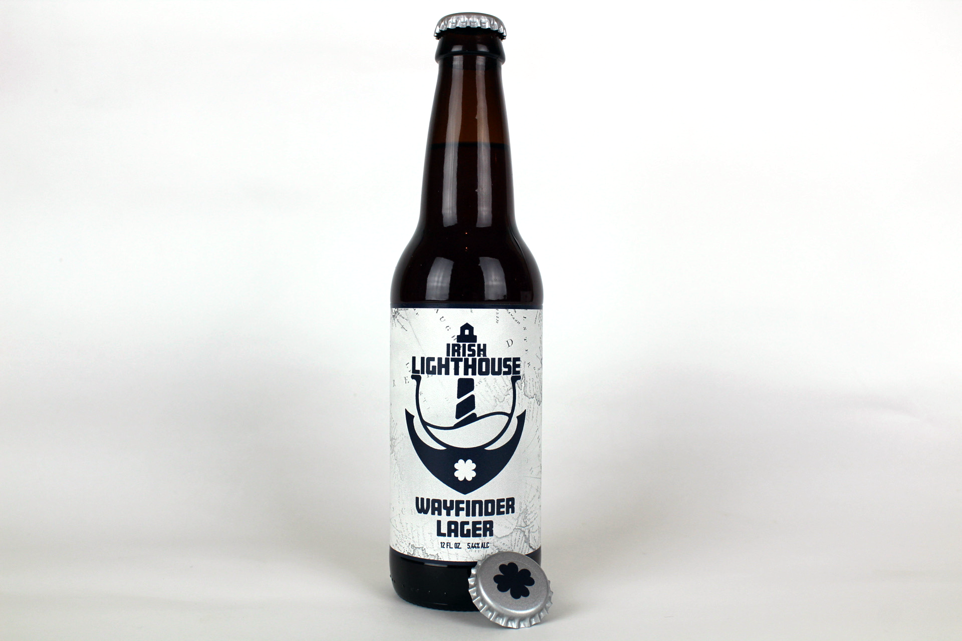
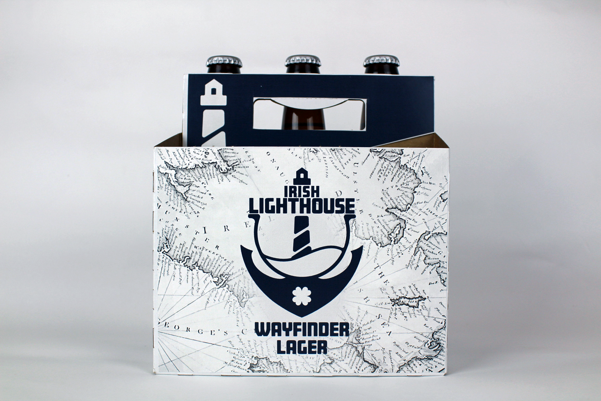
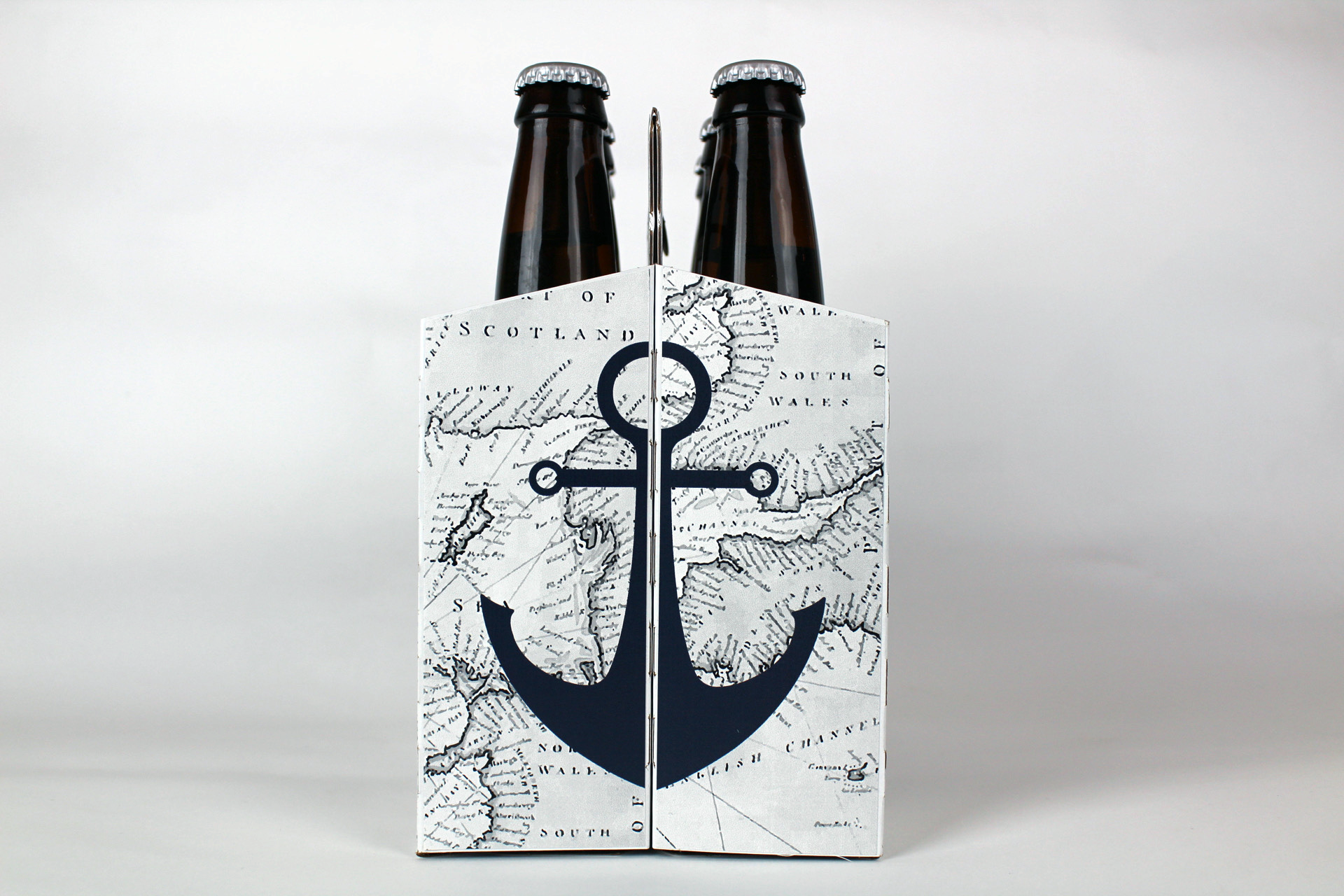
For the bottle label and the box art I vectorized an old map (from around the year 1792) of Ireland and the Irish sea. It makes a visually interesting background texture, and adds depth that the logo lacks. Then I could bring back the supporting elements of the lighthouse and the anchor. Making a nicely themed and well-rounded design.
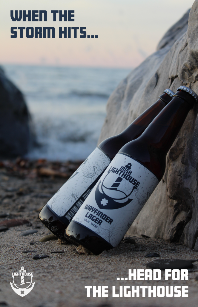
The main idea for the print ad was just to get the product into the actual location it’s themed around. To do whatever I could visually to support the designs that I had already finalized. Seeing the bottles in the sand with the waves and a subtle sunset behind them really drove home the theme behind the branding. The first part of the tagline “When the storm hits…” is a reference to not only a hazard one encounters sailing, but also a reference to the stress and difficulties faced in life. The second half being “…head for the lighthouse.” doubles as a reference to sailing again, using a lighthouse as a guide in a storm. It also acts as a call to action to the viewer to drink the product.