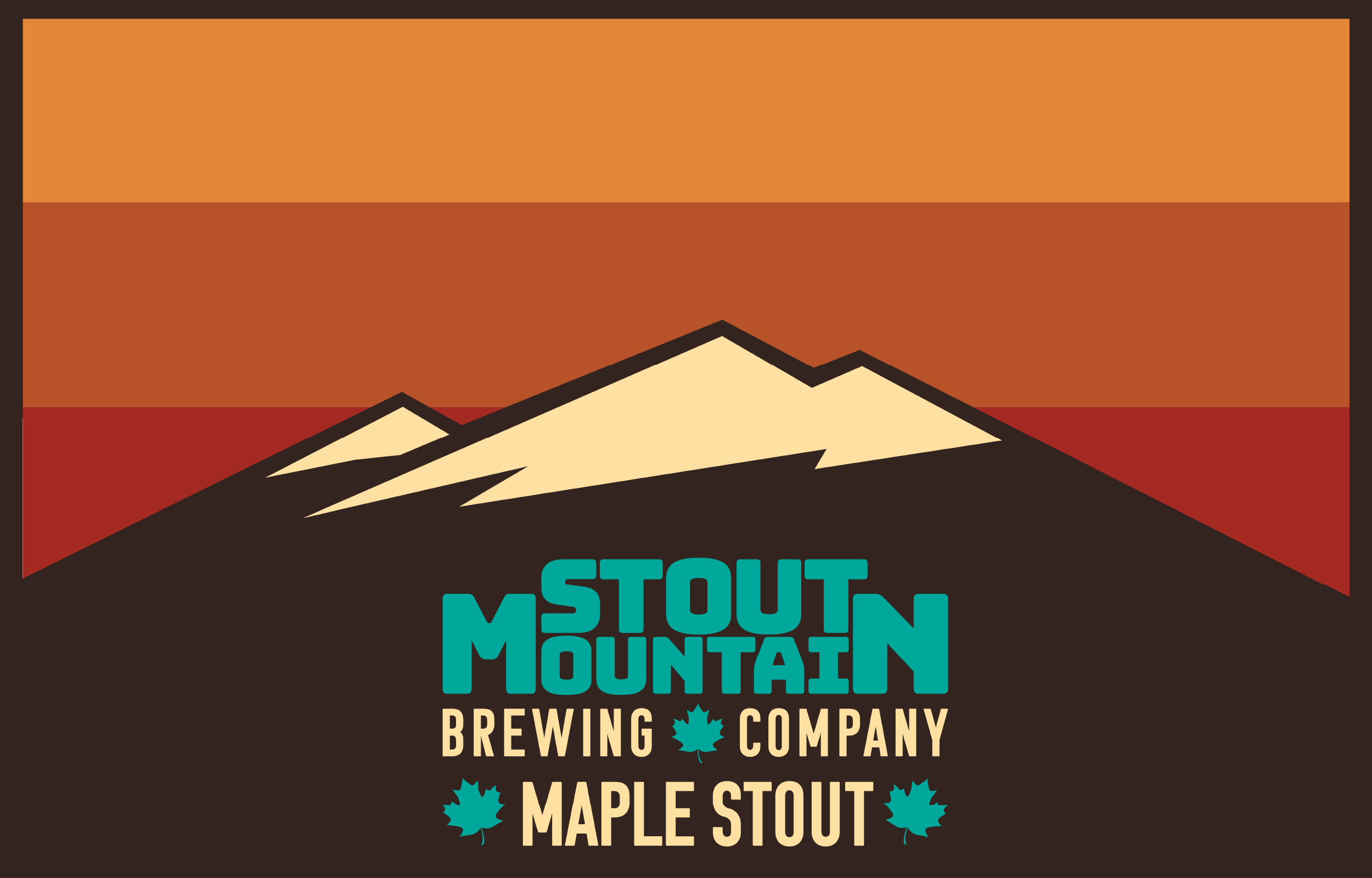
My senior exhibition consisted of branding designs for three fictional brewing companies. The goal was to have a logo, bottle labels, a 6 pack design, coasters, pint glasses, and an advertisement for each company.
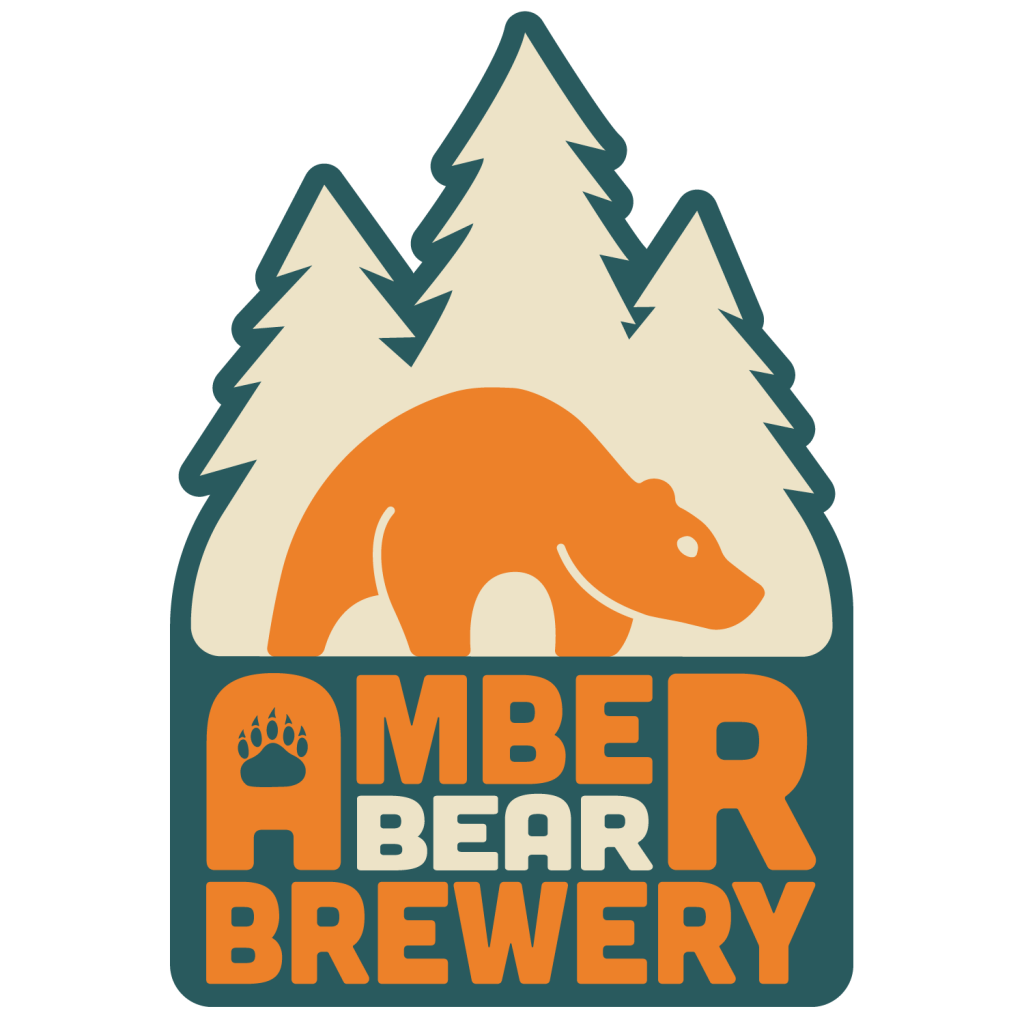
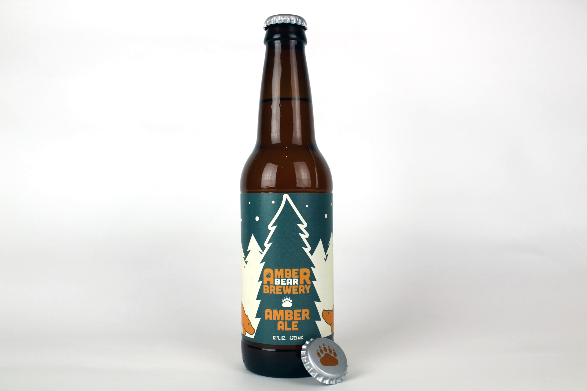
The Amber Bear Brewery is a Montana based brewing company, that has a design focused heavily on nature and wildlife. This is reflected in the color, as well as the supporting imagery. Which includes the bear, the paw print and the silhouetted trees. The name references “amber” which is fossilized tree resin with a stunning color, and is a gemstone used in jewelry. It is also a reference to the striking color of their Amber Ale, further connecting the company to nature. In the logo I used a brighter orange as the “amber”, and used the off-white and darker turquoise (also a gemstone) for contrast. The amber colored bear stands prominently in the center in front of a backdrop of trees. The other supporting element is the bear’s paw print, which can be seen inside the first “A” to add visual interest and further connect the name to the animal above it.
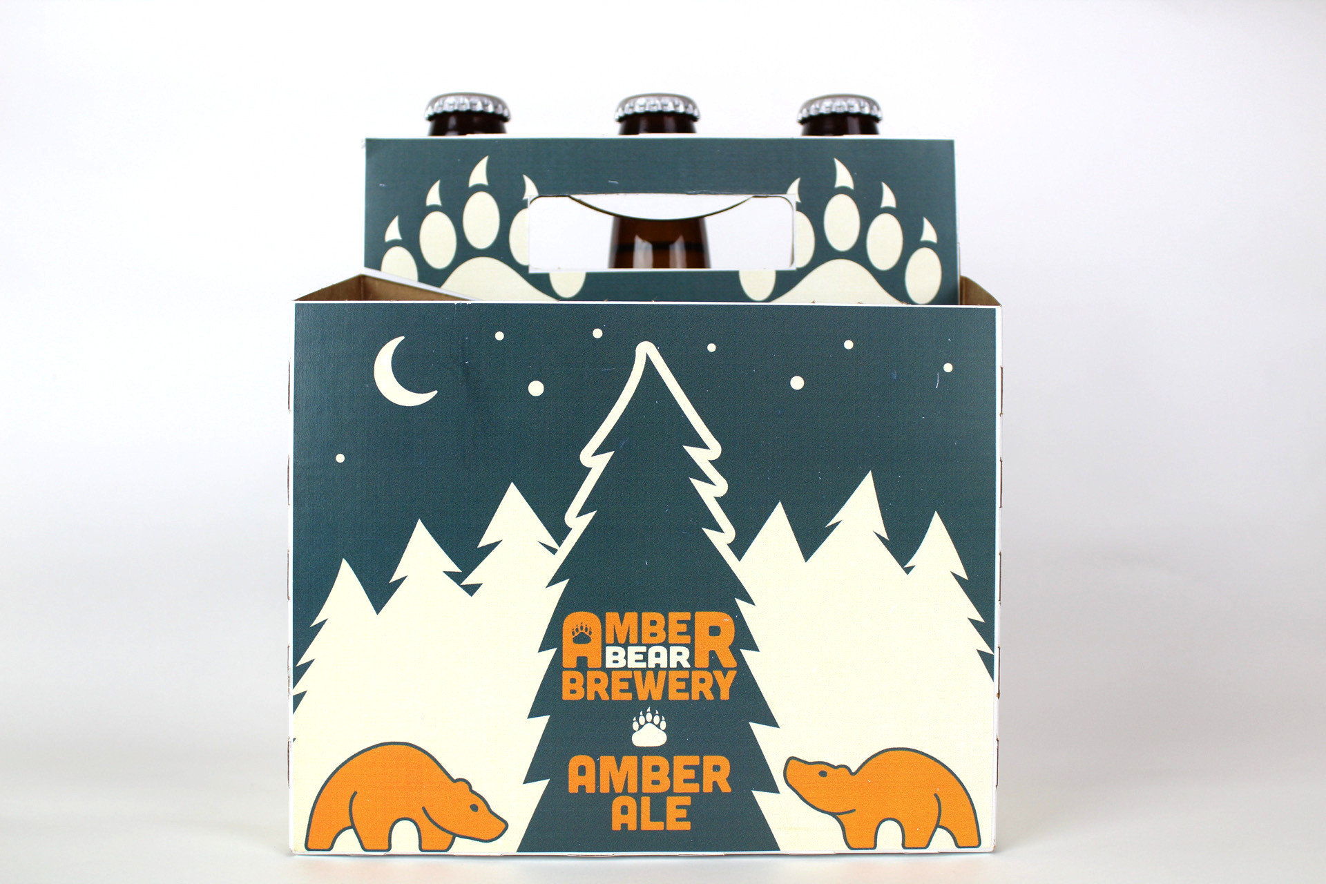
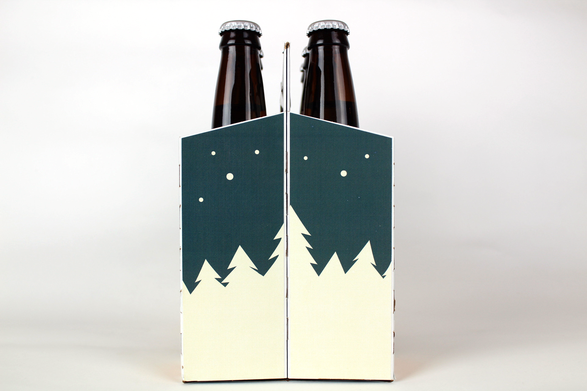
For the box art, I’ve continued the main themes from the logo and expanded on other aspects to better fit the space the box allows for. The handle includes two large paw prints, and the sides continue the silhouetted forest from the front. I have added a second bear, as well as stars and the moon in the night sky. I believe it properly expands on what the logo had to offer.
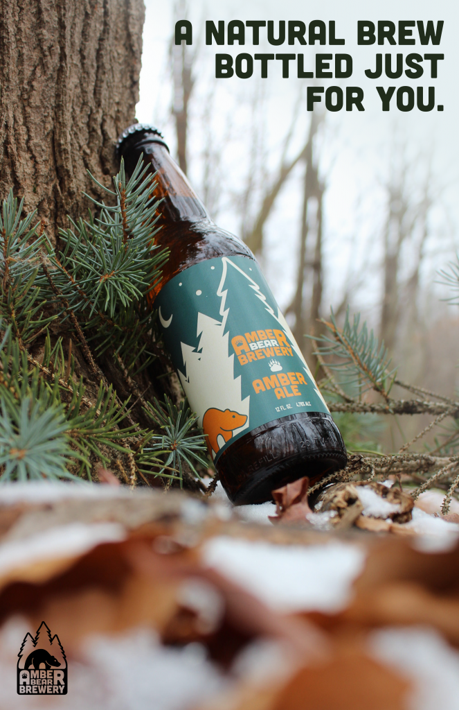
Seeing the bottle not only in a location the suits the brand, but also having the setting of the photo contain the same color scheme, drives the cohesiveness of the ad forward. Being a nature based company, the tagline needed to reinforce an idea of their product being based off of nature. Calling the brew itself “natural” makes sure that everything we are trying to convey visually is backed up by what we’re saying about the product. It’s a straight forward ad that focuses on conveying a very cohesive brand to the viewer, visually and through text.
